Conceptualized as a magazine aimed at the “core gamer” crowd, but with a more upscale art style. The main selling point of this magazine would not be only a decorative page layout, but also cut away at the more fluff-related parts of the games journalism industry rife with opinionated pieces that may not reflect accurately on what they’re meant to cover.
That is not to say an OP-ED section would not be included in this magazine, but I would make the opinion section be accurately reported on and reflect appropriately on the subject matter the article is covering.
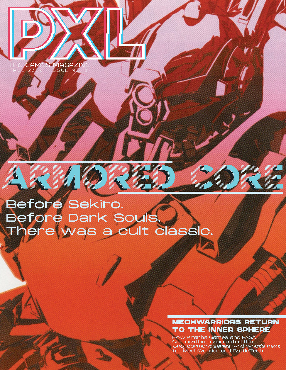
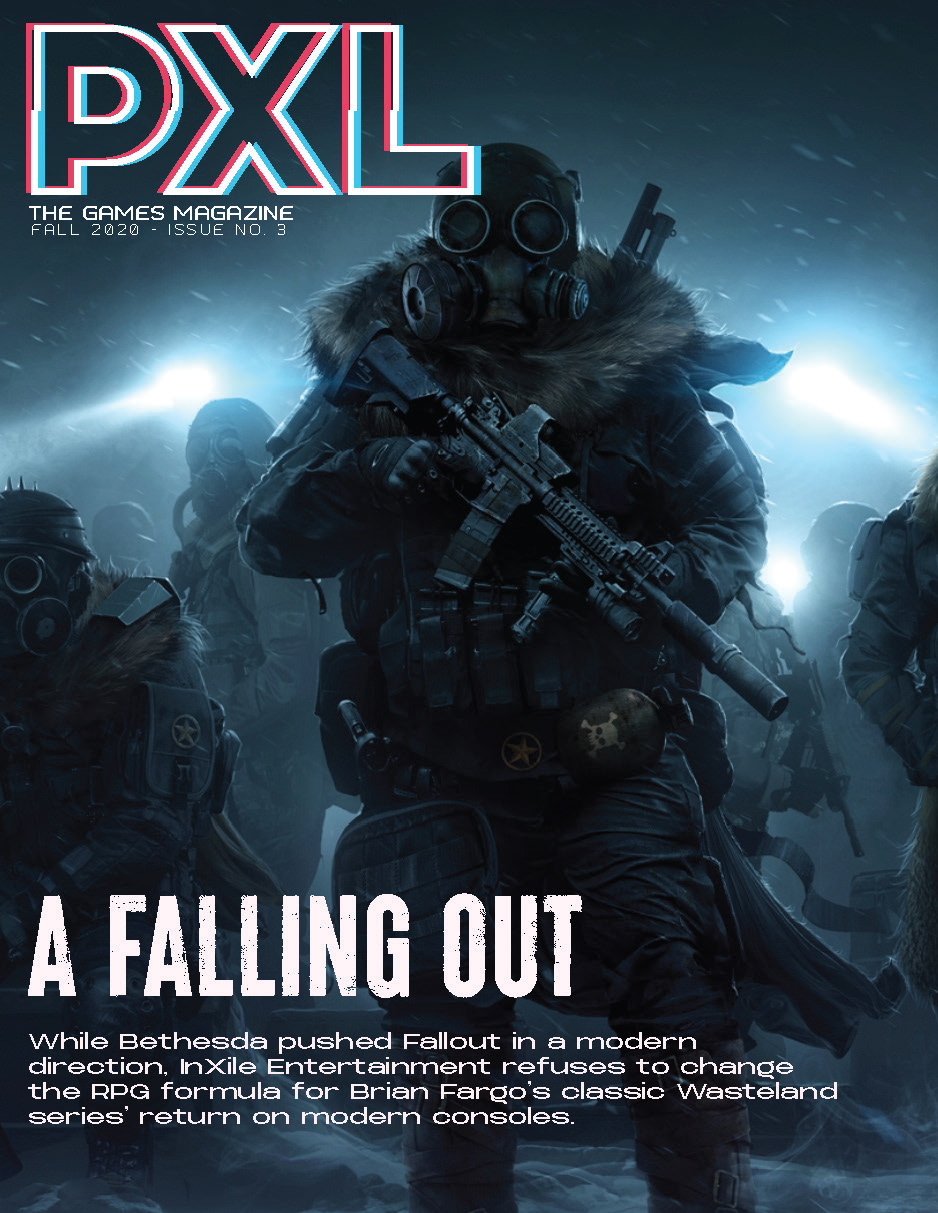
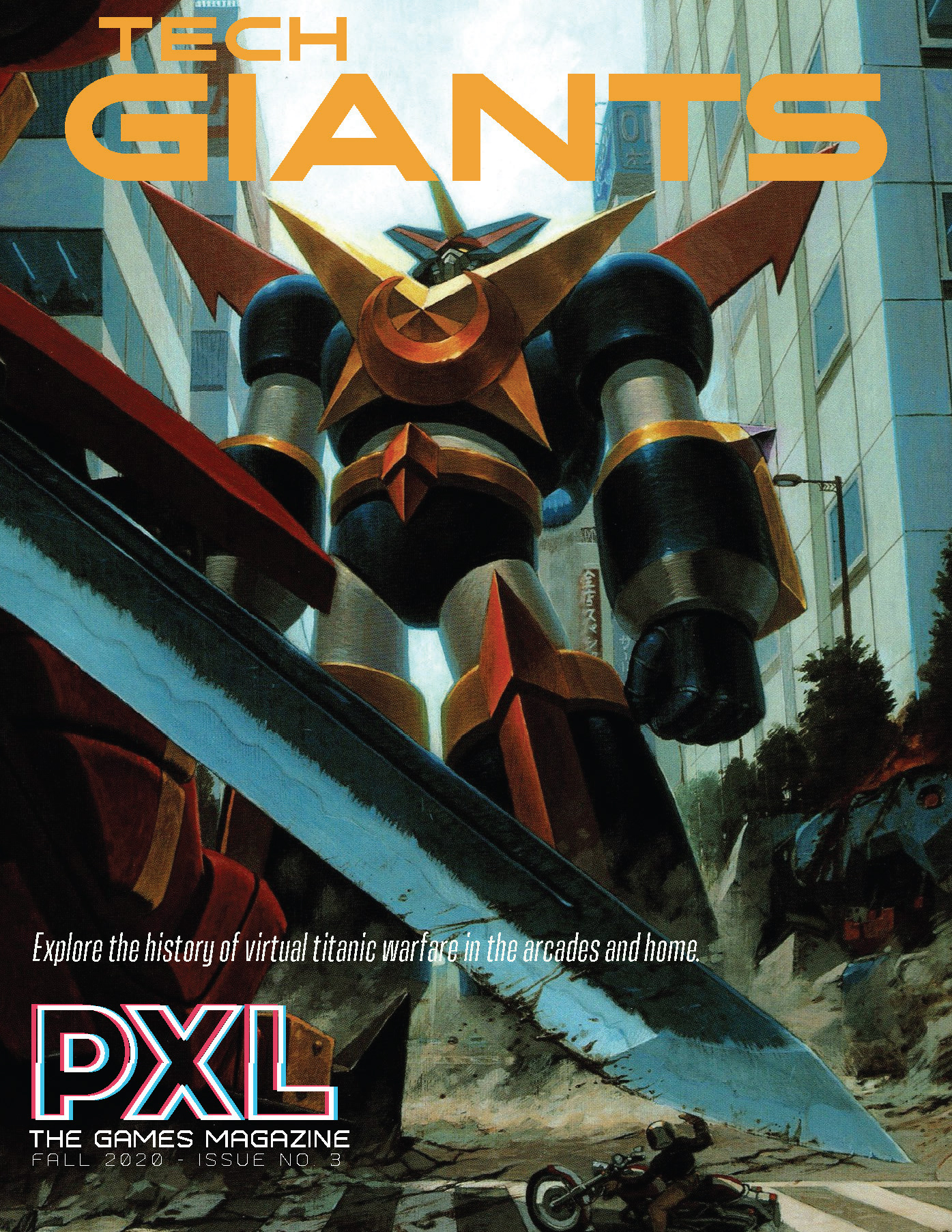
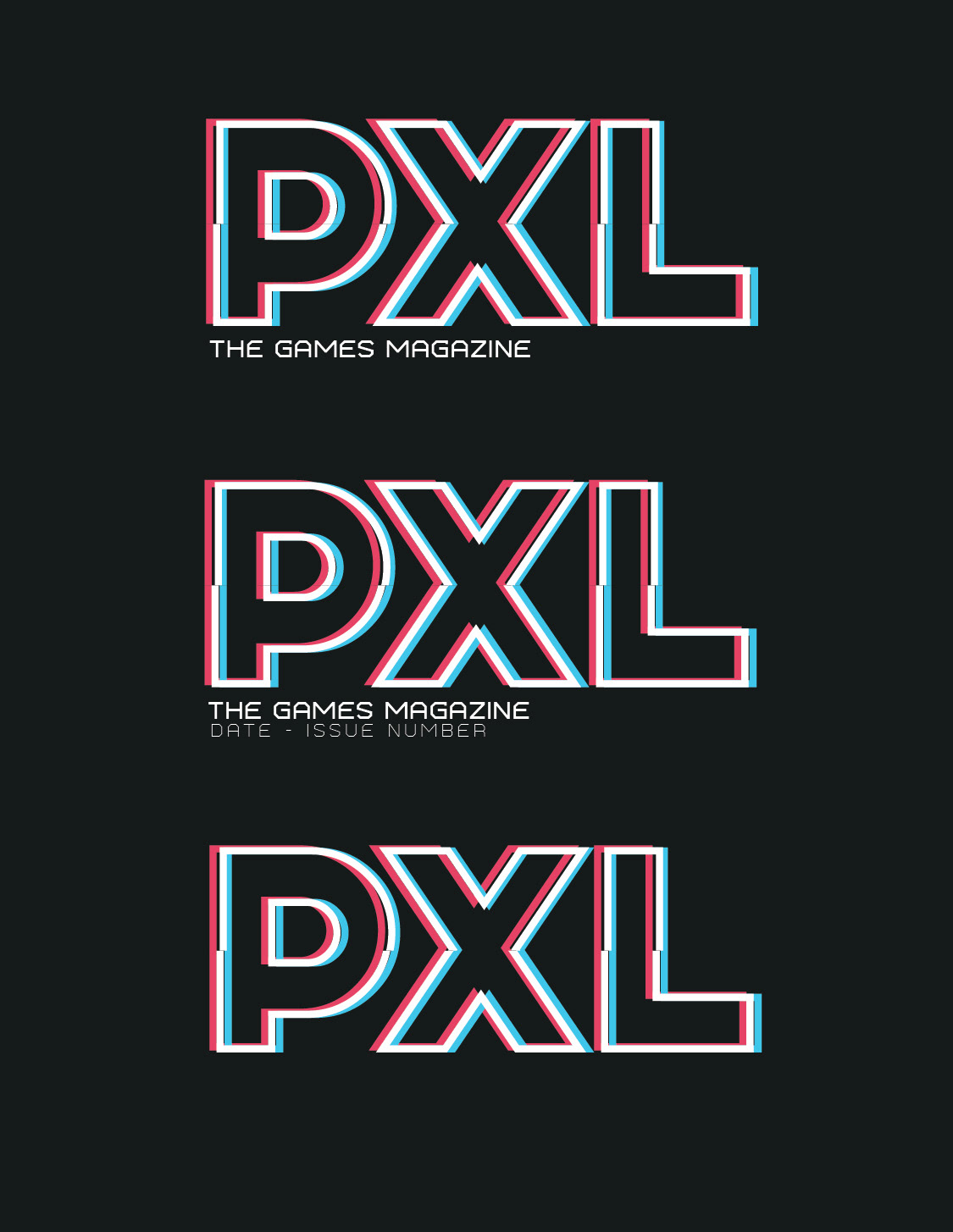
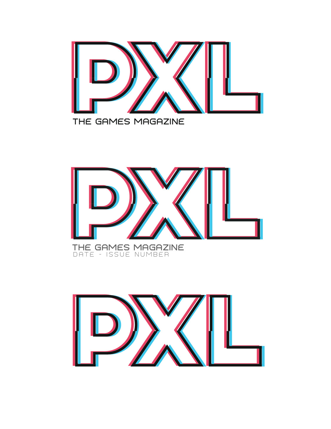
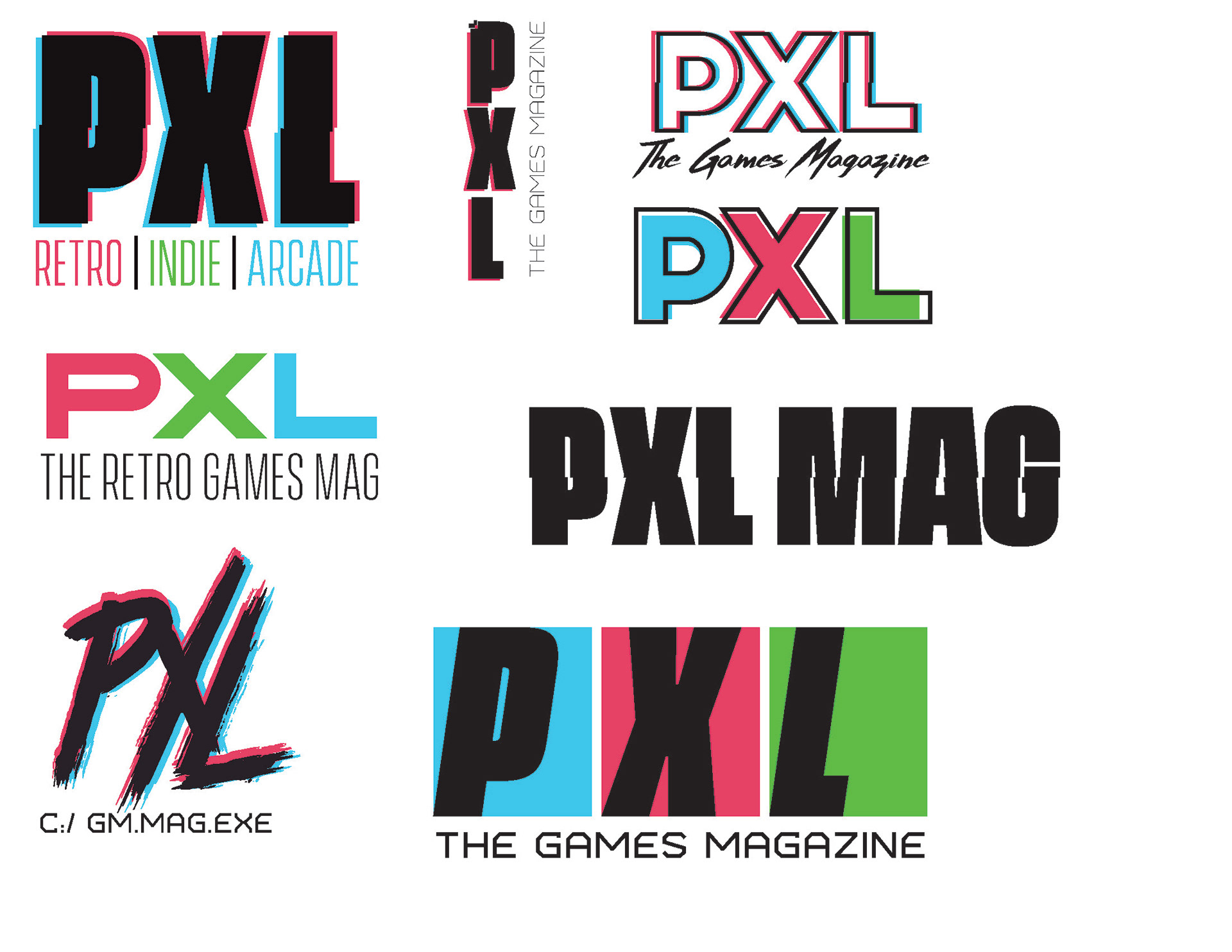
Masthead concepts initially were aimed towards bold aesthetics including the use of the classic “RGB” colors representing a pixel’s three color channels on a screen.
There were also discussions of a theme based on retro gaming, covering the preservation efforts and emulation community. That theme was deemed too niche and the branding was adjusted to include this niche as features, but not as the main draw.
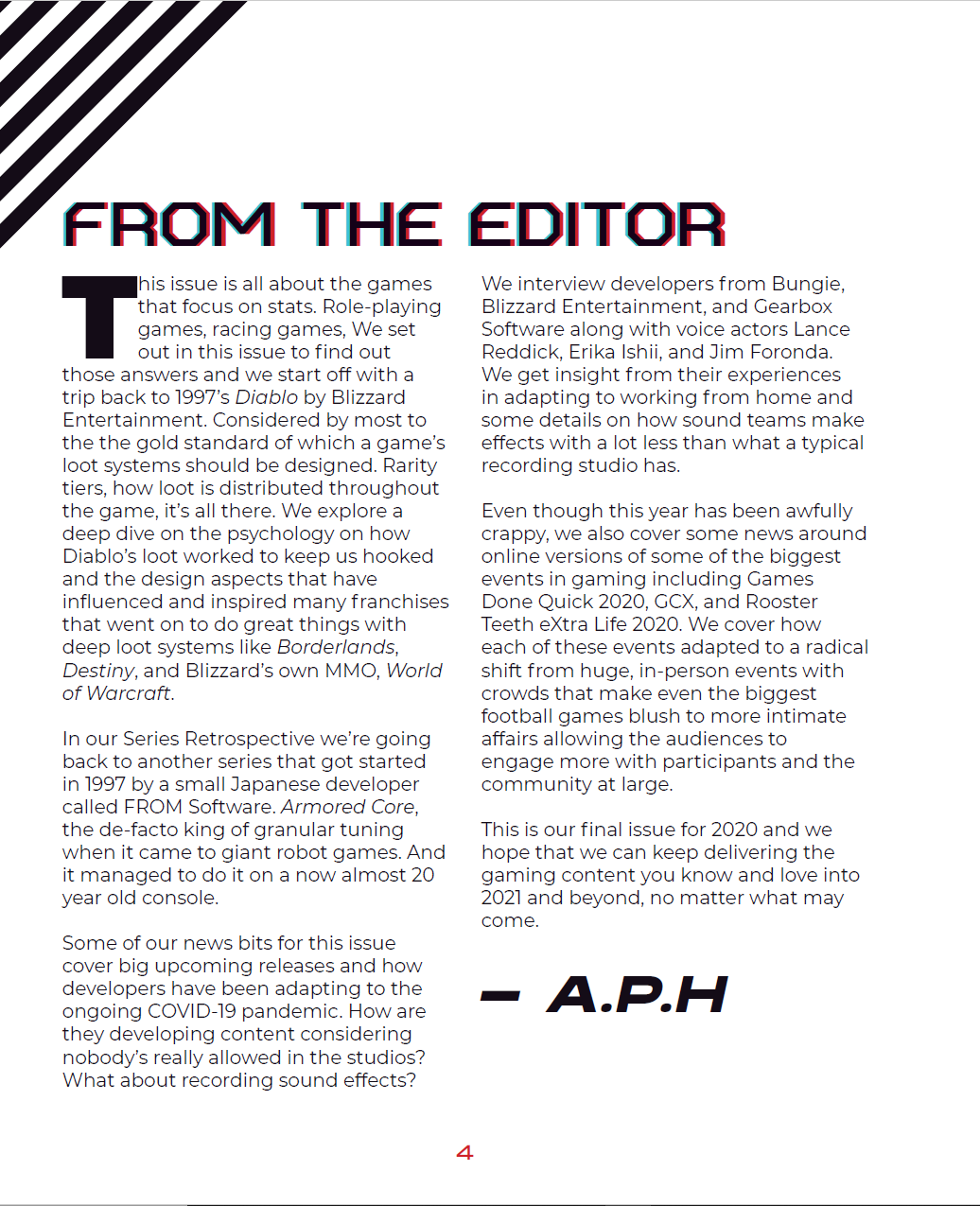
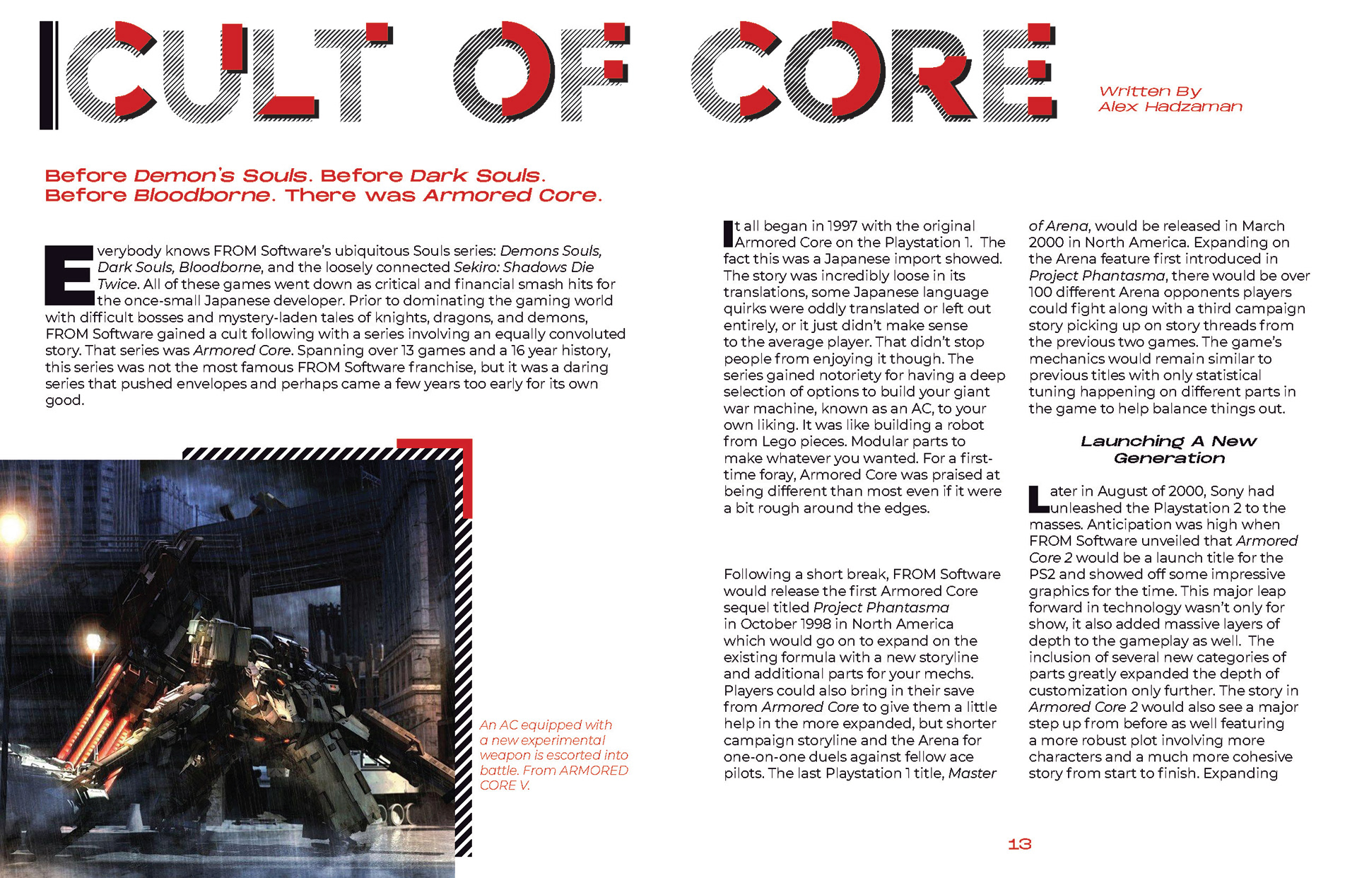
Fonts chosen were dominantly sans-serif types with weight expressing main hierarchy. More bold, decorative fonts would be used for headlines to give theme and variety to the articles. Serif or sans-serif would depend on the article’s overall theme. Primarily it would be a sans-serif font with wide lettering for callouts.
Iconography and decorative graphics within the magazine itself are centered around geometric highlights & page decorations meant to give texture to the page. I chose famous icons & shapes such as the silhouette of a controller, a 2D game character shape, and an 8-bit spaceship to be the main symbols to the branding.
An example of merchandise to promote the magazine with a pop-art style T-shirt.
