University of Baltimore
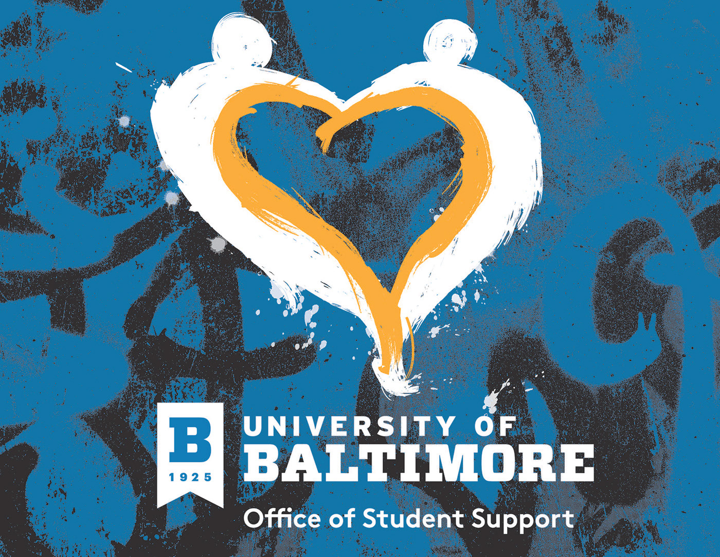
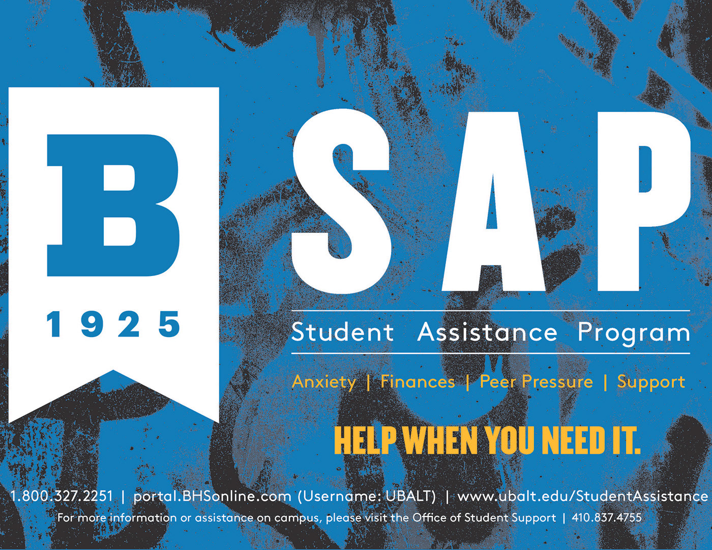
Branding & logo collateral developed for University of Baltimore's Office of Student Support and Student Access Program. All images, typography, and assets used were according to the most recent revisions of University of Baltimore's branding guidelines.
The heart shape for the Office of Student Support branding was meant to invoke the image of two people supporting each other, as is the Office's mission to help support students in time of need.
Just Mobile Ultrasound
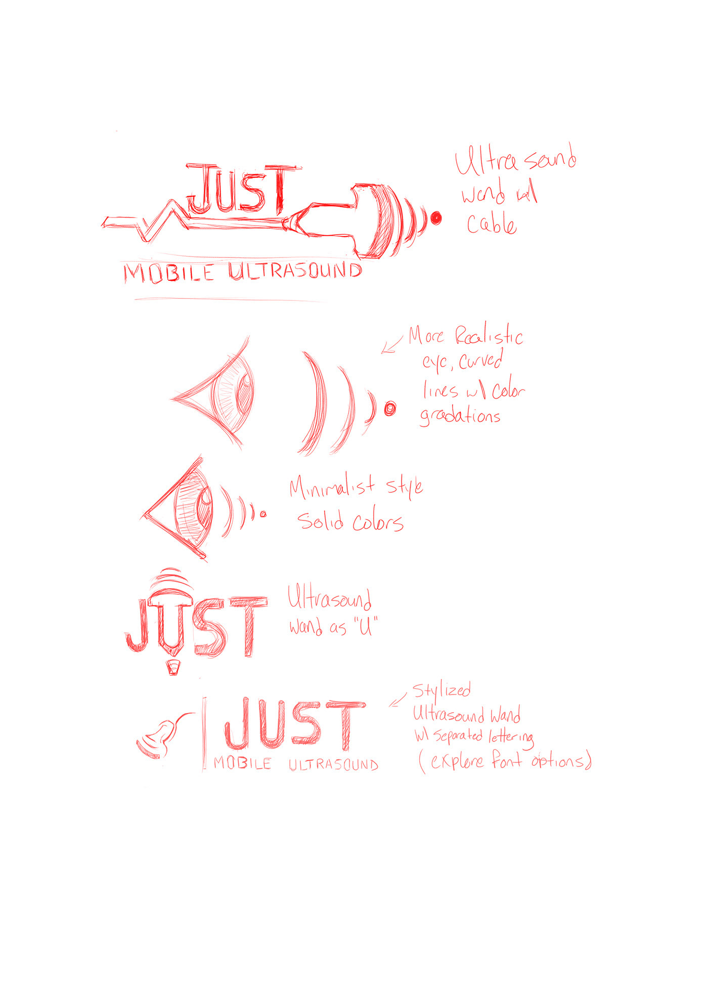
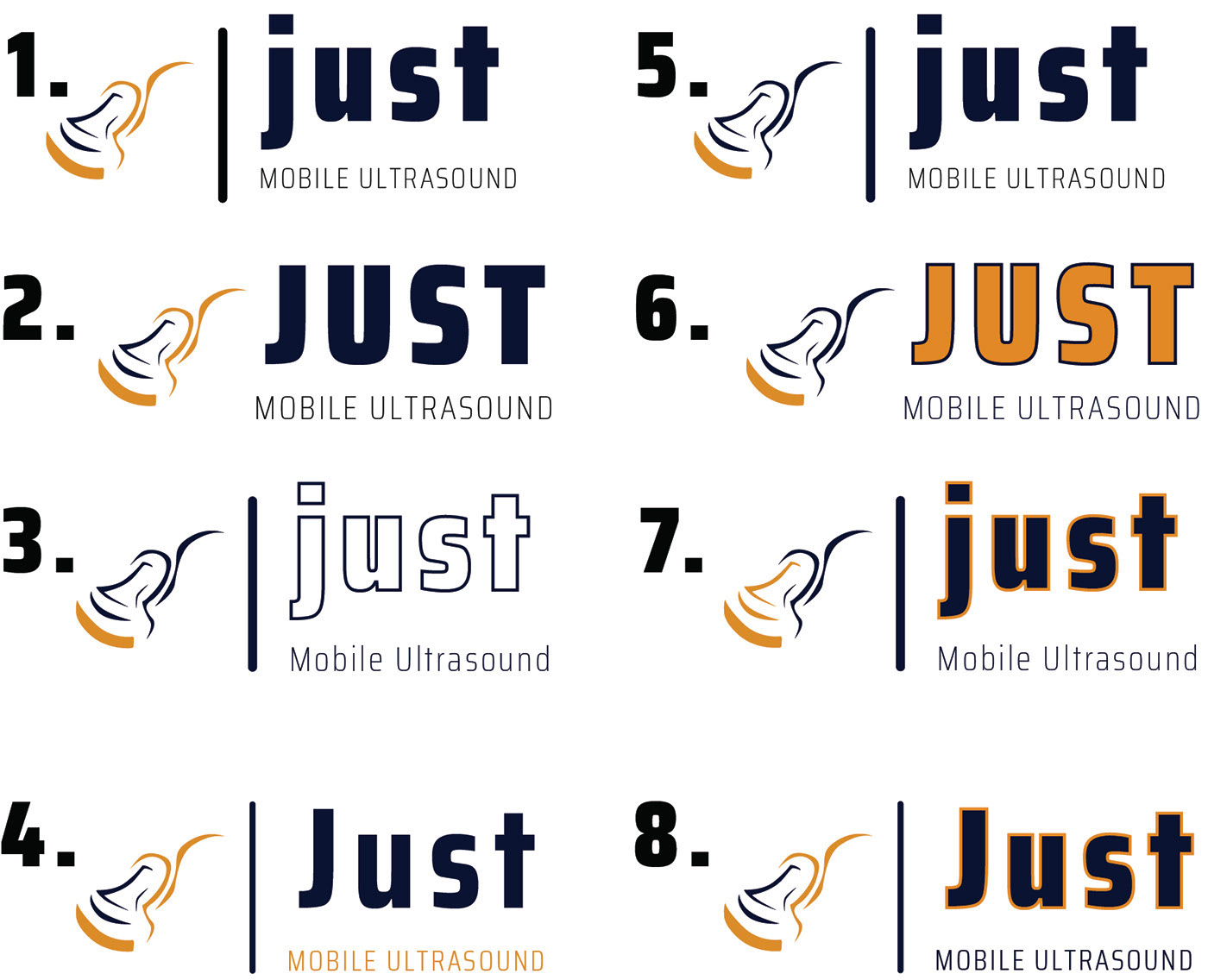
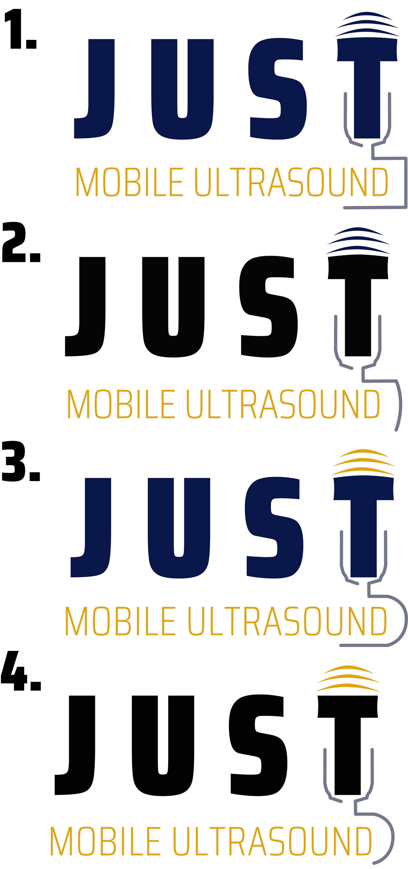
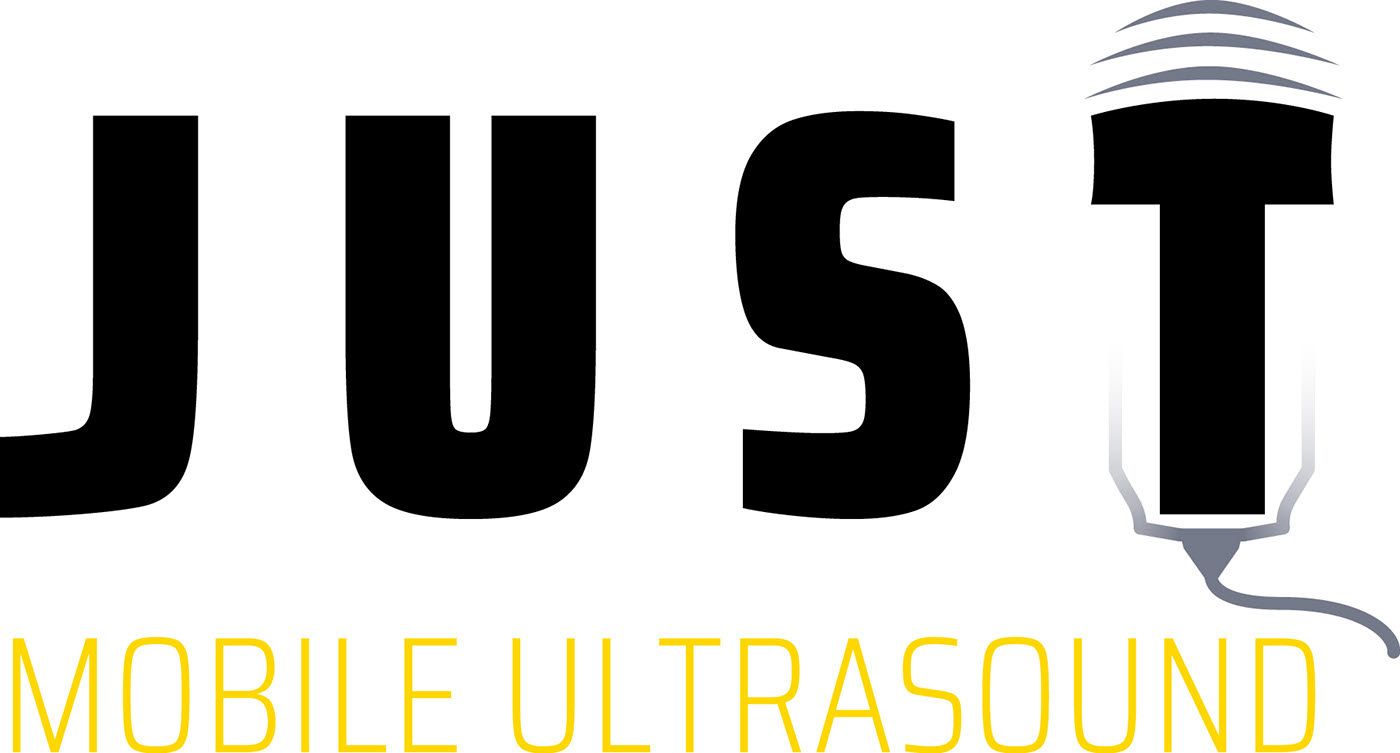
Logos designed for a local Baltimore area portable medical imaging business. Named for its owner, Just Mobile Ultrasound was branded according to requests from the client to design a logo featuring elements of an ultrasound. I originally iterated on a more typical logo with a symbol away from the typography, but then the client asked for something more exciting with it.
The "T" character is decorated to look like a large ultrasound wand with waves emitting from the end. Colors chosen are representative of the medical field with a dark midnight-blue, silver, and yellow which typically represent a trustworthy and high-quality brand.
Housing Authority of Baltimore City
A logo designed for the Housing Authority of Baltimore City's podcast / internal communications series called "Conversations with the CEO." These regular updates, typically in video or audio format presented to employees and occasionally the public would provide input and FAQs for the ongoing mission of the HABC and upcoming events that were being held (2020 notwithstanding.)
